P Chart with SigmaXL
What is a P Chart?
The P chart plots the percentage of defectives in one subgroup as a data point. It considers the situation when the subgroup size of inspected units is not constant. The underlying distribution of the P-chart is binomial distribution.
P Chart Equations
Data Point: ![]()
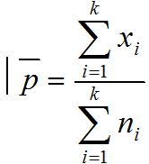
Center Line: 
Control Limits: ![]()
Where:
[unordered_list style=”star”]
- ni is the subgroup size for the ith subgroup
- k is the number of subgroups
- xi is the number of defects in the ith
[/unordered_list]
Use SigmaXL to Plot a P Chart
Data File: “P” tab in “Sample Data.xlsx”
Steps to plot a P chart in SigmaXL:
- Select the entire range of the data
- Click SigmaXL -> Control Chart -> Attribute Charts -> P
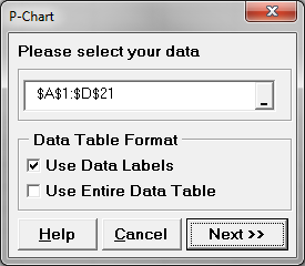
- A new window named “P-Chart” appears with the selected range automatically populated into the box below “Please select your data”.

- Click “Next>>”
- A new window also named “P-Chart” pops up.
- Select “Fail” as the “Numeric Data Variables (Y)”
Select “N” as the “Subgroup Column or Size” - Check the checkbox of “Test for Special Causes”

- Click “OK”
- A new window named “Tests for Special Causes” pops up. Click “OK” to proceed.

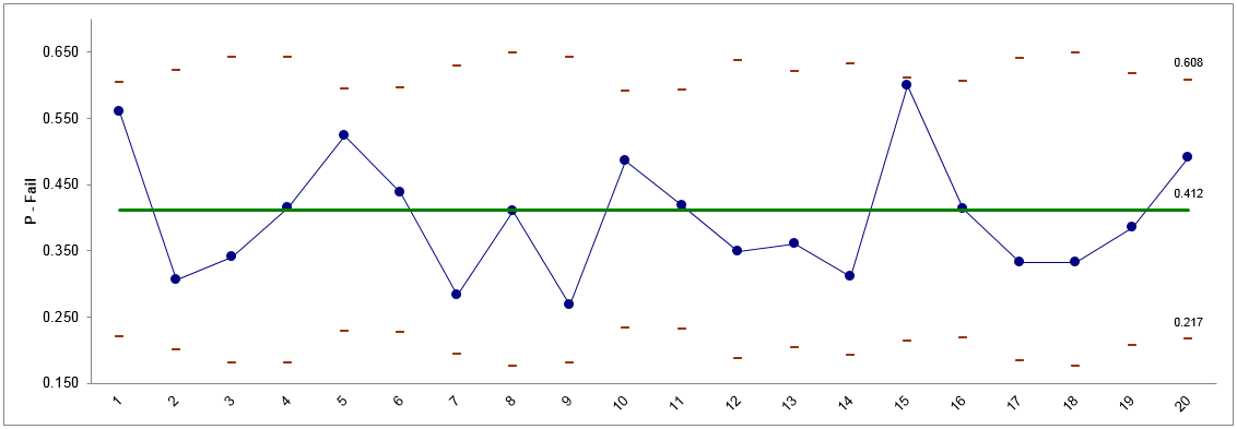
- The P chart appears in the newly generated tab “P-Chart (1)”.

P Chart Diagnosis
Model summary: Since the sample sizes are not constant over time, the control limits are adjusted to different values accordingly. All the data points fall within the control limits and spread randomly around the mean. We conclude that the process is in control.


